
What shades to choose when you want a clean interior or wardrobe without falling into monotony? The answer has changed in recent seasons. Minimalist palettes are no longer limited to the white-beige-gray triptych: they are structured around warmer neutrals, mineral grays, and natural tones that maintain sobriety while adding depth.
This article compares current minimalist color families to identify which ones work depending on the context, medium, and desired effect.
Minimalist Colors in 2026: Comparative Table of Color Families
Before deciding between a pure white wall and a sandy beige, you need to lay out the options side by side. The table below groups the main color families used in recent minimalist palettes, along with their visual rendering and preferred application area.
| Color Family | Examples of Shades | Perceived Rendering | Preferred Use |
|---|---|---|---|
| Pure and Off-Whites | Snow white, linen white | Bright, clinical if used alone | Small spaces, ceilings, poorly lit rooms |
| Sandy Beiges and Champagne | Warm sand, greige, champagne | Soft, enveloping | Living spaces, bedrooms, capsule wardrobes |
| Mineral Grays | Quartz gray, anthracite gray, soft gray | Sophisticated, structuring | Woodwork, furniture, fashion accessories |
| Natural Earthy Tones | Terracotta, chocolate brown, ochre | Warm, organic | Accent walls, textiles, clothing pieces |
| Muffled Greens | Olive, sage green | Soothing, vegetal | Bathroom, dressing room, accessory touches |
| Matte Black | Absolute matte black | Graphic, contrasted | Architectural details, belts, shoes |
What stands out: warm neutrals and mineral grays replace pure white as the minimalist base. White remains a tool (ceilings, small surfaces), but it is no longer the default starting point for a clean palette.
To choose the right minimalist colors for a wardrobe or interior, the logic is the same: start with a warm neutral rather than a clinical white, then add one or two accent shades in the same temperature.

Cool Palette vs. Warm Palette: What Changes in a Clean Look
Cold minimalism (white, light gray, glacier blue) and warm minimalism (sandy beige, greige, terracotta) have different effects on the perception of a space or silhouette. However, both adhere to the same principle: limit the number of shades to avoid visual overload.
Color Temperature and Textile Consistency
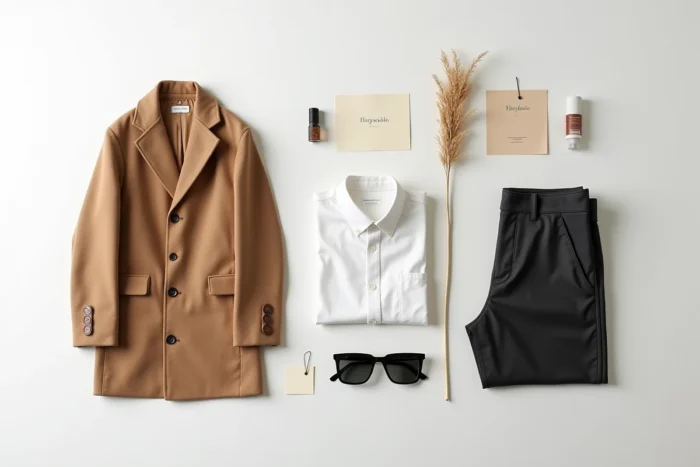
A minimalist wardrobe works better when all pieces share the same temperature. Mixing sandy beige pants with a bluish gray top creates a subtle yet real dissonance. Staying within a single color temperature simplifies all associations.
Recent trends clearly favor warm temperatures. Earthy shades (ochre, olive, chocolate brown) fit into a minimalist wardrobe without making it monotonous, as they vary in saturation while remaining in the same range.
The Case of Matte Black
Black remains a staple of the clean style, especially in fashion. In decoration, matte black serves as a graphic line (woodwork, handles, lighting) rather than a dominant surface. Matte black structures a minimalist palette without becoming its base. It works with both temperatures, making it the only true universal neutral in this approach.
Combining a Maximum of Three Shades: Restricted Circle Method
Most effective minimalist palettes are limited to three colors. Not two (too flat), not four (beginning of complexity). Three shades are enough to create contrast and depth.
- A base color (the most present): sandy beige, greige, or soft gray, depending on the chosen temperature. It covers walls, pants, coats.
- A secondary color (complementary in saturation): off-white, champagne, or quartz gray. It appears on tops, linens, light accessories.
- An accent color (the most saturated): terracotta, olive, chocolate brown, or matte black. It punctuates without dominating, on a cushion, a belt, a single wall.
Three shades in the same temperature cover all possible combinations of a capsule wardrobe or living space. Adding a fourth color is not a problem in itself, but it must replace one of the three existing ones in each outfit or piece, never be added simultaneously.
Sage Green and Terracotta: Accents That Remain Minimalist
Among the natural tones compatible with a clean style, two stand out for their versatility. Sage green and terracotta regularly appear in recent minimalist palettes because they share a property: their medium saturation does not create an aggressive focal point.
Sage green works particularly well in bathrooms and textiles (towels, light curtains). Its vegetal tone softens mineral surfaces like polished concrete or stoneware. In fashion, a sage green knit sweater is a great substitute for yet another gray top without breaking the overall sobriety.
Terracotta, on the other hand, brings warmth without tipping into rusticity. An accent terracotta wall in a sandy beige living room adds depth to the space. On a wardrobe, a terracotta piece (scarf, bag, shoes) is enough to visually anchor a neutral outfit.
In contrast, some natural tones like mustard yellow or saturated burgundy are more challenging to integrate into a minimalist approach. Their intensity draws the eye and requires a more complex balancing of the rest of the palette.
Materials and Finishes: The Parameter That Color Alone Does Not Resolve
Two walls painted in the same sandy beige will not have the same rendering if one is matte and the other is satin. In fashion, a greige linen pant and a greige polyester pant do not produce the same impression of quality. The finish alters the perception of color as much as the shade itself.
Organic materials (linen, wool, raw wood, stone) absorb light and make neutrals softer. Synthetic or lacquered materials reflect light and harden the same shades. In a minimalist interior, prioritizing matte finishes and natural textures allows you to maintain the warmth of the palette without adding extra color.
A successful minimalist look thus relies on two simultaneous choices: shade and material. Selecting a sandy beige in linen rather than synthetic, a quartz gray in felted wool rather than shiny jersey. The material does the work that color cannot do alone.
The colorimetric minimalism of 2026 boils down to a shift: from pure white to warm neutrals, from smooth to textured. The most refined palettes consist of three shades, a single temperature, and materials that let natural light do the rest.